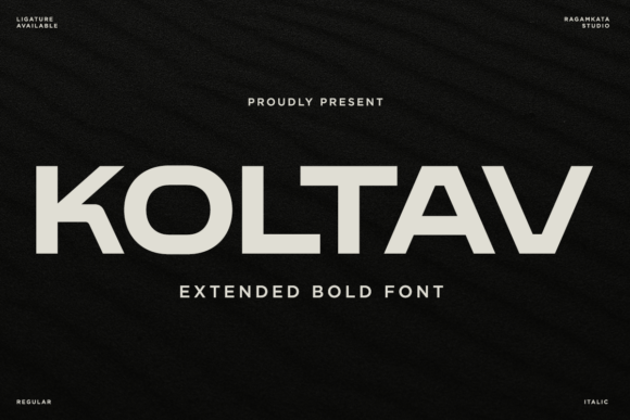
Koltav: A Bold Display Typeface for Impactful Web Design
As a web designer who builds landing pages, SaaS dashboards, and boutique e-commerce experiences, I look for display fonts that do more than look striking—they need to function with clarity, confidence, and consistency. That’s why Koltav stands out in my toolkit. It’s not just another bold font; it’s a carefully engineered display typeface built for digital prominence—wide proportions, uncluttered geometry, and strokes that command attention without sacrificing legibility.
Koltav’s visual personality is rooted in strength and simplicity. Its confident letterforms avoid ornamentation but gain presence through deliberate spacing, open counters, and balanced weight distribution. On screen, this translates to immediate readability at large sizes—even on lower-DPI mobile displays or fast-scrolling hero sections. Unlike overly condensed or tightly spaced bold fonts, Koltav breathes. That breathing room makes it highly effective for scanning: users instantly grasp hierarchy, intent, and tone before reading a single word.
Where Koltav Delivers Real Digital Value
In practice, Koltav excels where visual impact meets functional clarity:
- Hero headers and landing page titles—its wide stance fills viewport width gracefully, anchoring messaging without crowding layout rhythm;
- Call-to-action buttons and banners—especially on dark backgrounds or image overlays, where its strong contrast and clean edges prevent visual bleed;
- Branded section headings in course sales pages, portfolio case studies, or service offerings—reinforcing authority and intentionality;
- Online store banners and product launch graphics, where short phrases (“New Collection”, “Limited Edition”, “Join the Waitlist”) need instant recognition and emotional resonance;
- Digital brand kits and editorial web experiences, where Koltav serves as a tonal anchor—pairing seamlessly with neutral sans serifs for body copy or refined serifs for long-form content.
It’s not designed for paragraphs or small UI labels. Koltav shines in short, high-impact roles: logo lockups (when used sparingly), headline treatments, navigation accents, and social media ad variants exported from Figma or Webflow. Its extended proportions make it especially effective on wide screens—but responsive testing confirms it holds up well down to ~480px when set at 32–40px with appropriate line-height and letter-spacing adjustments.
Readability & Responsiveness: Practical Notes
Koltav performs reliably across environments. On light backgrounds, its stroke weight delivers crisp definition. Against dark gradients or photography, it maintains contrast without needing heavy text shadows—just ensure your CSS includes font-display: swap for smooth loading. For mobile, avoid setting Koltav below 28px in headlines; smaller sizes risk losing its structural clarity. Buttons benefit most when Koltav is paired with generous padding and subtle hover transitions—not animation, but thoughtful pacing.
On image overlays, use a semi-transparent background or subtle text stroke only if necessary. Koltav’s inherent legibility means you rarely need those crutches—especially with proper color contrast (aim for WCAG AA minimum of 4.5:1 against backdrop). Its geometry also scales cleanly in SVG exports for branded icons or animated micro-interactions in Lottie or GSAP-driven layouts.
Smart Font Pairing for Digital Clarity
Koltav thrives in contrast. I consistently pair it with a highly legible, neutral sans serif—like Inter, Manrope, or even system-ui—for all body copy, form fields, and navigation. This creates clear visual separation: Koltav sets the tone, while the supporting font handles the work. For editorial or luxury-facing sites, pairing Koltav with a restrained serif like Literata or Cormorant Garamond adds dimension without competing—ideal for blog headers or testimonial quotes.
Avoid pairing with other bold display fonts, script fonts, or decorative serifs. Koltav’s confidence doesn’t need reinforcement—it needs balance. When building a full type system, treat Koltav as your primary display voice: one weight (Bold or ExtraBold, depending on the package), reserved for moments that define your brand’s stance.
Licensing, Formats & Real-World Use
Koltav ships as a premium font with standard webfont formats (.woff2, .woff) and often includes variable font support—making it efficient for modern builds. Check whether your license covers web embedding, SaaS platforms, client projects, and e-commerce storefronts (e.g., Shopify, BigCommerce). Most reputable vendors offer tiered licensing: personal use, commercial site use, and extended rights for template creators or agencies. Always verify multilingual support if your audience spans Latin, Greek, or Cyrillic scripts—Koltav typically covers extended Latin character sets, but diacritics and OpenType features (like stylistic alternates or case-sensitive forms) vary by version.
For designers delivering Figma kits or Webflow templates, confirm whether the license permits redistribution—even as static assets. And if you’re integrating Koltav into a WordPress theme or Notion brand kit, ensure your usage aligns with the vendor’s terms. Licensing isn’t overhead—it’s how we sustain quality design assets and respect the craft behind tools like Koltav.
Ultimately, Koltav earns its place not because it’s loud, but because it’s intentional. In a landscape saturated with fleeting trends, it offers a stable, scalable voice—one that strengthens brand identity across touchpoints without demanding attention at the expense of usability. Whether you’re launching a creative agency site, refining a wellness app’s onboarding flow, or designing a limited-run product drop, Koltav gives your typography grounded confidence. Not flash. Not noise. Just clarity—with weight.